
We could describe information design as communicating a message in it's simplest form in a way that an audience will understand. This could be portrayed though various ways: Using text and images, using typography to communicate visual hierarchy and breaking down complex information so that to an audience will understand in the quickest and most efficient way possible. Colour is a major aspect of visually communicating information and is a prime example in information design to group more visually demanding elements together.

Otto Neurath, Invented Isotype, a form of communicating that didn't use letters and sentences that communicated information to normal people about their place in the world. Otto broke into a form of design where it allowed pictures to be illustrated to the public in a language-like format, as most Isotope is amongst verbal elements.
 Otto Neurath inspires me as a visual communicator because of him breaking the boundaries of information design by the use of print and text to illustrate quantitative data in an easier format. This to me is what communication is all about and what a lot of designers these days strive for, maybe not in the context of icons to describe real life things but in the passing down of information in a visual context for the audience.
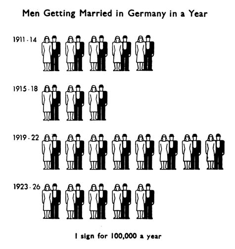
Making sure each pictogram was a precise calculation for a number of events, people or things in which an audience would evidently view and decipher. What I really like a bout Otto's work is that everything has been stripped down to it's basic minimum and his stencil like style which has been created by the use of prints make the icons very bold and crisp.
Modern adaptations have also been created by other designers (below) we can see an infograph of the twitter community which with the use of color and universal images (such as the female and male symbol) have been used so that everyone can understand in the quickest and easiest way about in this case about the population of social giant: Twitter. This particular infograph was created by David Mcandleless, a London based designer and interdependent Data Journalist.

 Otto Neurath inspires me as a visual communicator because of him breaking the boundaries of information design by the use of print and text to illustrate quantitative data in an easier format. This to me is what communication is all about and what a lot of designers these days strive for, maybe not in the context of icons to describe real life things but in the passing down of information in a visual context for the audience.
Making sure each pictogram was a precise calculation for a number of events, people or things in which an audience would evidently view and decipher. What I really like a bout Otto's work is that everything has been stripped down to it's basic minimum and his stencil like style which has been created by the use of prints make the icons very bold and crisp.
Modern adaptations have also been created by other designers (below) we can see an infograph of the twitter community which with the use of color and universal images (such as the female and male symbol) have been used so that everyone can understand in the quickest and easiest way about in this case about the population of social giant: Twitter. This particular infograph was created by David Mcandleless, a London based designer and interdependent Data Journalist.
"Information is beautiful"

No comments:
Post a Comment