Presentation for design hero talk here.
Instead of doing 5 blog posts for each museum trip, I have done one each based on what I thought was interesting.
Wednesday, 17 April 2013
Monday, 15 April 2013
The Herbert Gallery Coventry
(Caught in the Crossfire exhibition)
Arriving in Coventry I did not know what to expect from the Caught in the Crossfire exhibition, I have heard that a lot of famous and politically moving images are said to be held in The Herbert Gallery in this particular exhibition but it wasn't till I set foot in the place till I realised what they actually meant.
 Inside the exhibition artists have created their work in response to conflict, peace and reconciliation, artists are aiming to tackle both the reality of war and the desire for peace. Many pieces in Caught in the Crossfire depict war- the home front lines of war and such more intricate things such as the horrific struggle in which war brings. There was many pieces to see in the exhibition but my favourite piece has to be peace soldiers by Banksy. Seeing this in it's real form really made me quite surprised not just because Banksy is a well known "street-artist" as per say but because of the simplistic nature of the form of the piece. Even the scale of the paint drips compared to the scale of the soldiers are very realistic and precise.
 Some pieces in the museum were more interesting than others. There was one piece, created by Al Johnson named Roaring Girls which, at the present time I didn't pay full attention to because I thought the art was weak but upon reading why the art had been created It shows that it was series of guns and shells based on real weapons but stitched from scarlet textiles and bearing female names to consider the involvement of women in warfare. I liked this collection of images because I believe that the fabrics get the audience to look at the image as a whole not just "this is a plane" this is a gun" The use of fabrics allow the audience to see the whole Item as a whole instead of being confined to smaller details.
Sunday, 14 April 2013
Bmag Museum Birmingham

Being over a century old, Birmingham's museum and art gallery opened it's doors to the public on the 28th november 1885 and has aimed at the time to inspire craftspeople and industrialists to this day. Many ranges of pieces come in from around the world to Bmag from all sorts of places such as: South Asia, Japan and Northern Europe.
 Upon entering into the museum, there was once piece out of a whopping 500,000 pieces that caught my eye. It was work by John Cockshore whos artwork has been inspired by JRR Tolkien's book series,The Lord of the Rings. John's landscape photography and editing capability as allowed him to illustrate certain scenes in the book with computer aided visuals. He describes Tolkiens language as detailed, vivid and provocative in which he tries his best to captures unusual items from around the region that he lives in and super-imposes them into landmarks from the books which I think is a great Idea as he gets the audience to grasp that magical illusion in artwork based on a very good piece of literature.
What I also like about Johns work is that It allows people to fill in the gaps or see parts of the book in real life and that's why I think his work is so popular because LOTR's still has quite a big worldwide fanbase.
Friday, 12 April 2013
IKON Birmingham


Visiting the gallery with my university group there was two exhibitions on at the time, one by John
Flaxman and another by Timur Novikov. Knowing little about both the artists I was a little skeptical yet open but on the first floor of the gallery stood John Flaxman's work. Born in 1755, John's vast collection of illustrations capture the eyes of his audience by what I think to be one of the only reasons why I personally like his art is the detail hes put into the one movement of the pencil. His use of line is so precise in it's start and end that the way he draws all his concepts the realism of shadow and perspective is ever so more perfect.

 Upstairs was the next exhibition
which was Timur Novikov's who has a very "unique" style of working on cuts of fabric sewn on top of bigger cuts of cloths. Growing up in a political time in Russia, Tiumurs work was supposedly influential during the 1980's and the 1990's in which his use of bright fabrics and colour illustrates an important anti-war message.
As much as I wanted to, I didn't really enjoy Timur's pieces. They just seemed to me that they were a little too...easy you know. I don't mean to sound too big for my boots but If I sat down with some different coloured cloth, a pair of scissors and some glue ones Idea could easily become a reality..
This is some work I have done in my RVJ (shown below) is based on my recent trip to the IKON museum based on sketches and the moment of line.

Sunday, 7 April 2013
Tim Allen (Animation)

"I can be found locked in the darkroom with my puppet friends"
 Being a lover of drawing, reading comics and making models, Tim Allen is a animator born and bred in the heart of England itself. Opting out of A-levels Tim started a 2 year art diploma in which at that stage he didn't know that animation could ever be used to pay the bills ! After years of job searching Tim finally got an animation audition for an Ealing Animation studio in London in which he got the job because he was cheap and "easy to impress". This job allowed him to work on his first piece titled El' Nombre, a popular low-
budget cartoon series by the BBC which used stop-
motion animation. After the 8 months of the job had finished, Tim went on to look for more work and has always had appreciation for Tim Burton, an indigenous writer and animator from the United States who's work includes: The Nightmare Before Christmas and Batman. When the "Corpse Bride" also by Tim Burton was soon to be made, Allen jumped at the chance to animate for it, applying for the role with his show-reel a whole three times and a grueling three day interview before he finally got accepted.
 The Flying Machine started off as an half-hour animated film, which started off like most animations with an animatic which was pre-visualation of the film- on the computer.

The animation appeals to all ages, and The Magic Piano is an extraordinary example of Tim Allans great creations.
Peter Chung (Animator)

Peter Chung, a Korean /American animator whos best known for his works such as: The Rugrats movie, The Chronicles of Riddick: Dark Fury and Transformers. Peter has lived in many places of the world including London and Nairobi and even Tunis.
Kick-starting his animation career at the age of 18 in Maryland, he worked for lead animator and illustrator Dominic LoPiccolo then finally being hired to Disney for feature development. So what made Peter Chung so popular in the animation world today? Why is his process of animating differ to everybody elses?
 Back in 2003 The Animatix was released, a feature length animated film based on the Matrix Trilogy which if you haven't seen already is about the human population amerced in an artificial world, created by machines. The film consists of 9 animated short film, one being named "Matriculated" being written and directed and directed by Peter himself, which I have to say is definitively worth a watch. Coming in late to the process, Peter was used to doing everything by hand. This included drawing and using 2D elements but when it came to working with the Animatrix at the time Peter describes finally being able to use 3D elements for a change is a tremendous relief. But this doesn't mean he has to stop drawing slides by hand, the computer will just aid putting frames together.
 Peter tried to base the scene on what he thinks and feels about, trying his hardest to make the act seem as if a robot was allowed into a human dream, cool right ? He did this by making sure the drawings for the robot character which had to be portrayed in a way that it came across as a living, thinking and feeling consciousness. Peter spent months designing and re-designing the concept for the robots in the film making sure that the robot he was designing had to have to right look of menace yet a look of innocence. It was a strict rule that the robot would not be allowed a human face or anatomy.
Peter Chung's creative desire of story-telling is shown in his scene in the Animatrix and shows that mystery and ambiguity serve an important function in visual art today.
Thursday, 4 April 2013
Matt Pyke

 Working in such areas of design, from extensive commercial adverting to visual indents, Matt Pyke has an interesting yet intriguing thought and design process. Commissioning work for such companies such as Hyundai, AOL and Audi. Matt allows for a fluid and design that really does make the audience think about what's being created. Matt's design process got me thinking about the structure of basic forms of things that are not accoiated to the human form for example architecture. He states that by adding feet and basic life-like aspects such as eyes to the models that they are preceieved in a completely different way and that's what like the most about his work. He gives things a soul, may that be though animation, photography or design. I also find that his work is very influential as most advertising today is lacking that certain spark or vital connection to the audience at hand. Matt has incorporated the aspect of human movement to his pieces moreover we can see this in-definitively in his work with MTV showing his "Mr Furry ident". Personally I feel that each "furry" are placed in an order where it displays a personality of their own especially with the animation the audience pick up that they are completely different people.
His work is very appealing and popular, especially with the creation of the "Hyundai Vision wall" we see that movement is shown though a series of neon colors and bright patterns slowly turning into chrome. What I like about this is that it really shows the intricacy of the parts of an automobile yet highlighting that in there complex moment it is moving like a fully functioning human being who we all know is the most naturally complex also compared to a man-made object. The lines almost remind me of the flow of watercolor paint as it hits the backdrop.

Wednesday, 3 April 2013
Infomation Design

We could describe information design as communicating a message in it's simplest form in a way that an audience will understand. This could be portrayed though various ways: Using text and images, using typography to communicate visual hierarchy and breaking down complex information so that to an audience will understand in the quickest and most efficient way possible. Colour is a major aspect of visually communicating information and is a prime example in information design to group more visually demanding elements together.

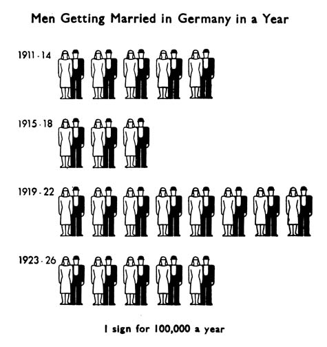
Otto Neurath, Invented Isotype, a form of communicating that didn't use letters and sentences that communicated information to normal people about their place in the world. Otto broke into a form of design where it allowed pictures to be illustrated to the public in a language-like format, as most Isotope is amongst verbal elements.
 Otto Neurath inspires me as a visual communicator because of him breaking the boundaries of information design by the use of print and text to illustrate quantitative data in an easier format. This to me is what communication is all about and what a lot of designers these days strive for, maybe not in the context of icons to describe real life things but in the passing down of information in a visual context for the audience.
Making sure each pictogram was a precise calculation for a number of events, people or things in which an audience would evidently view and decipher. What I really like a bout Otto's work is that everything has been stripped down to it's basic minimum and his stencil like style which has been created by the use of prints make the icons very bold and crisp.
Modern adaptations have also been created by other designers (below) we can see an infograph of the twitter community which with the use of color and universal images (such as the female and male symbol) have been used so that everyone can understand in the quickest and easiest way about in this case about the population of social giant: Twitter. This particular infograph was created by David Mcandleless, a London based designer and interdependent Data Journalist.
"Information is beautiful"

Tuesday, 26 March 2013
Different but Simple..
"Tell students to strip everything away, down to the bare bones. They make things way too complicated"-Vineet Raheja
 As we look around today's vast world that we live in, what do we see ? Clear, ever stretching indigenous plains? A starry haven of a clear mid-summer sky? or busy cities filled with even busier advertising! What ever happened to simplicity in today's design world ? What ever happened to design that was clear and to the point? I mean that's what the backbone of the visual communicator is about! To express an idea in the easiest, quickest and in an effective way where the audience will remember the product and/or Idea.
 |
| Shortcuts? |
today has already achieved that. Take Apple for example, their simplistic and sleek products and even their advertising has always been straight and to the point leaving room for design adaptation and speculation towards to company. But we could say that a lot of company out there have no yet achieved this. Do not get me wrong I am not saying that apple is the target for all us visual communicators to aim for but Apple is a prime example of that simplistic advertising is working in today's ever changing society. Moreover this is due to Apple's overall branding, all their products have been stripped down to their basics and this is why in some peoples eye their products are "simple yet beautiful".
A company who's advertising campaign is simplistic yet still illustrating their key main theme is Lego. Coming across this piece of recent advertising I felt nostalgic to the creations of my childhood spent playing and creating with these little pieces of painted plastic.
Created by Pittsberg based design group Brunner, lego's advertising (seen below) allows for the audience imagination to fill in the "rest of the story". Sure two lego blocks stuck together make a shape but the shadows allow the audience to fill in those gaps to say yes this maybe a ship or plane or anything else. I admire legos simplistic design, and even without font this works for me, living up to the quote that a picture is actually worth a thousand words. Lastly I personally think that the target audience would appeal to a young audience and parents (I for once would by my son/daughter a set just to boost their creative thinking, as it did to mine) but I think this is communication at one of it's simplest forms..


Friday, 25 January 2013
Saul Bass

1920-1996
"Saul Bass wasn’t just an artist who contributed to the first several minutes of some of the greatest movies in history; in my opinion his body of work qualifies him as one of the best film makers of this, or any other time"
— Steven Spielberg, 1996
A 20th Century American graphic designer, Saul Bass is really a legendary Character in design of the century especially his work with film, print and logo creation. Back in 1955 when the film "The Man with the Golden Arm" was released Saul made sure that before the movie was shown the projectionists were given the task to show the film's titles, as back then it wasn't the norm. Saul finally opened his own studio in 1950 but continued to work for big names in the film industry such as: Otto Preminger, Alfred Hichcock and Stanley Kubrick. As a designer, Saul Bass has a unique and genuine style which was a big stepping stone to visual communication in the 20th century.
 What really impressed me about Saul is his corporate logo design which was commissioned by such companies such as ATnT and Kleenex. Some particular logos created by Saul has been shown to be kept by the company for a very long time, the average lifespan of one being an incredible thirty four years. His designs caused controversy and speculation as they were a completely new style to the competition.

Saul's poster designs started off in Hollywood and as you can see they all have a very unique style. The basic use of color allows important information to be communicated in a better way. His use of space and overall design allows for key features such as who is actually starring in the film to be recognized by the audience easier, which back then wasn't really noticed by the general public. My favorite poster has to be Bass's Steven Spielberg's Back To The Future poster. I personally like this more then the rest of his artwork because of his use of color and perception to draw the audience into the center of the image but still achieving to the audience to notice the title first.
Bunny Lake is missing (1965) has an interesting title sequence, designed by Bass where paper is ripped in multiple directions to reveal names. The clip can be found here. Powerful enough, the hand movements that rip the paper show that there is something hiding behind the top layer, reinforcing the plot of the film.

Sagmister and Walsh [1962- Present]

“It is very important to embrace failure and to do a lot of stuff — as much stuff as possible — with as little fear as possible. It’s much, much better to wind up with a lot of crap having tried it than to over-think in the beginning and not do it"
Residing in New York with a successful graphic design and print firm, Sagmister works collectively with Jessica Walsh, a designer and art director who has won several awards, including a distinction of Computer art's "Top Rising star in designer". Sagmister started graphic design at the age of fifteen and later received a Fulbright Scholarship at the Pratt Institute in New York. In 1993 Stephan Formed Sagmister .inc and has continued his ideas on branding and Identity; as this been reflected in many commissioned pieces to clients clients such as Jay/Z, The Rolling Stones (Universal Music Group), Levi's Jeans and non profit organisations such as The Azuero Earth Project.
 What startled me when looking into Sagmister was that on their firm's website it shows a live shot from the top of their studio which updates every few seconds which I thought was quite nifty and also a good way to show to the public eye that creativity is constantly flourishing in the studio. Is this a good way to gain more client incite? Their interactive website links to pages that are actually written on the floor of the studio to be clicked upon online, could we say that this illustrates and strengthens the image the job a graphic designer has to do- work in unison with their client ? And make the client feel they have a strong involvement within the basis of what they want to achieve.
 One of the most interesting pieces by Sagmister and Walsh is their "Seven deadly sins and seven deadly virtues" set of drinking glasses which incorporates aspects of illustration and product design. Based on a vision by Adolf Loos back in early 1931, Sagmister has adapted Loos's glasses into a concept that depicts the seven deadly sins and seven deadly virtues of life all illustrated at the bottom of each glass. Personally, as the adults being the target audience this could maybe even lead to a heated debate about ethics at the dinner table as the pictures reveal themselves at the bottom of the drink? Each individual glass costs a pricey $305 dollars but there wouldn't be any point buying just one now ? The collection will set your wallet back a sparse $2135 and a long with paying back a hefty £8500 university fee it would be more of a sin to purchase it to hold your favorite liquor.

 What startled me when looking into Sagmister was that on their firm's website it shows a live shot from the top of their studio which updates every few seconds which I thought was quite nifty and also a good way to show to the public eye that creativity is constantly flourishing in the studio. Is this a good way to gain more client incite? Their interactive website links to pages that are actually written on the floor of the studio to be clicked upon online, could we say that this illustrates and strengthens the image the job a graphic designer has to do- work in unison with their client ? And make the client feel they have a strong involvement within the basis of what they want to achieve.
Wednesday, 2 January 2013
WTF?! ...
What the font?!
"The creative process is not performed by the skilled hand alone, but must be a unified process in which the head, heart, and hand play a simultaneous role”- Herbert Bayer
As designers we ask ourselves the important question of "How will my particular piece of design visually communicate towards the target audience; and what message will be portrayed". Knowing this, we can take precautions in order to allow our audience to feel or notice a piece in a certain way, order, or style. There is reasons for creating a piece in this way as it's specific characteristics allow the audience to potentially remember the meaning of the artwork, or even better place an idea or meaning into their train of thought.
 |
| Political street art shows French President Nicolas Sarkozy in a different light. |
There are three main disciplines of design: Design for invitation, Design for information and Design for expression. Each of these individual disciplines require different outlooks:
Design for Invitation allows an offer, service or idea to be translated into a form of communication.
Design for Information allows for complex data or information to be filtered down to a simple complex.
Lastly Design for expression allows for emotion value and ethics to be substituted to a graphical language.
All three of these disciplines are recognized in today's advertising and illustrated in the quote by Herbert Bayer (above). Illustrating that you cannot be a designer by just knowing how to use a pencil or pad, by ruling out our mindsets and our passion- design outputs would be lifeless and lacking creativity and thought. The quote teaches us that we cannot lack any part of an idea or a topic that is being performed otherwise the final product would be lifeless. Hand, heart and head have to work in unison for a creative process to be successful.
Another key way in which the creative process is constructed is though type and font. But not just any font will usually be suited to a particular design. Manipulating and engaging with text can make or break a piece, and is often hard to know which one to choose at times but we as designers have to remember that type is just like speech in the way certain fonts will demonstrate various tones and emphasis to sentences or words. How can an audience know what type of message the design is saying if the font communicates to them a totally different message then the design at hand ? Thinking about Target Audience when placing font is important too using the example of showing something to a younger audience, a designer would have to think about using an easy to read font and think more about the space and structure of the words.
Subscribe to:
Comments (Atom)